Nike365
耐克365
Nike's first Chinese & non-latin typographic identity.
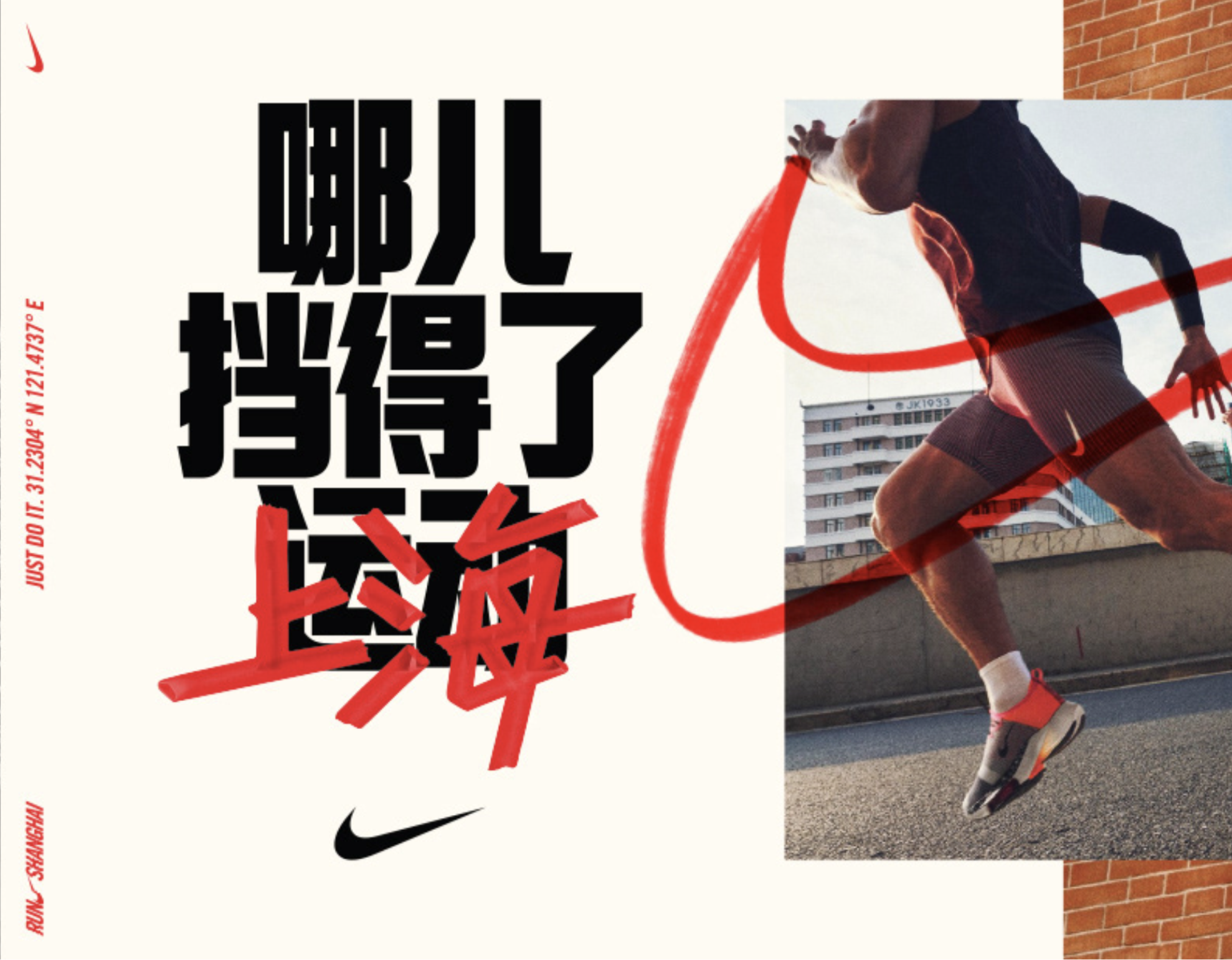
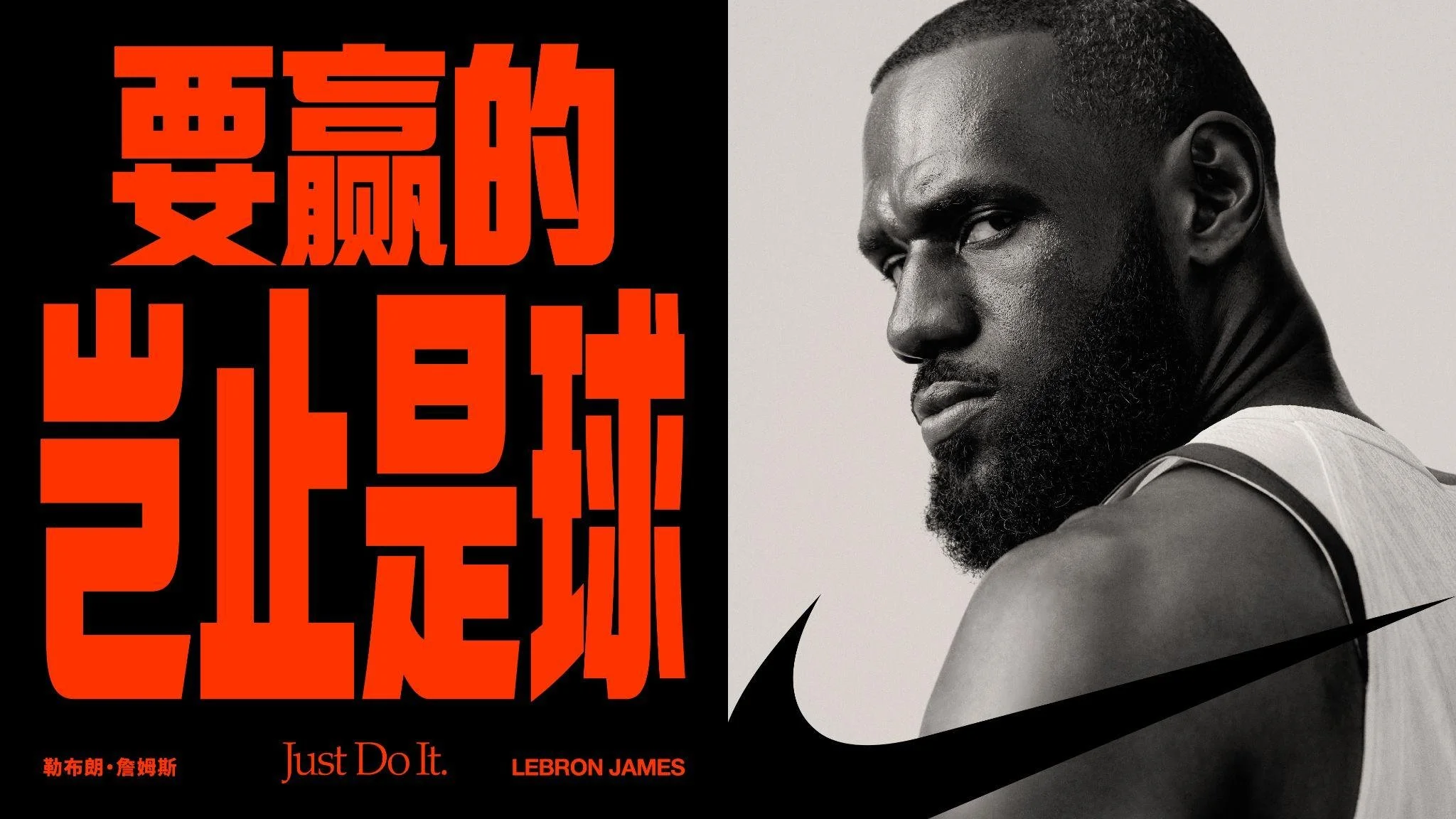
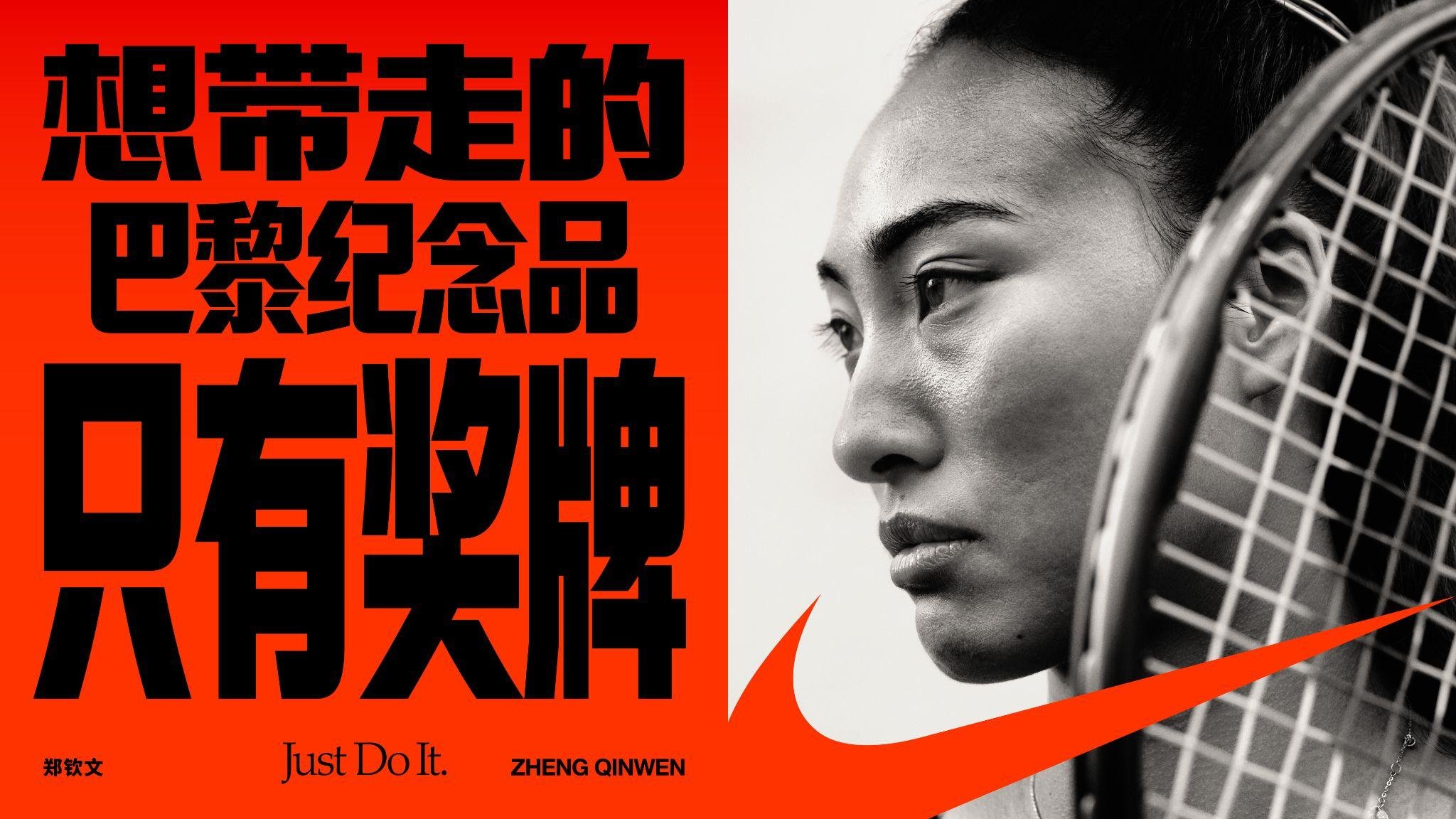
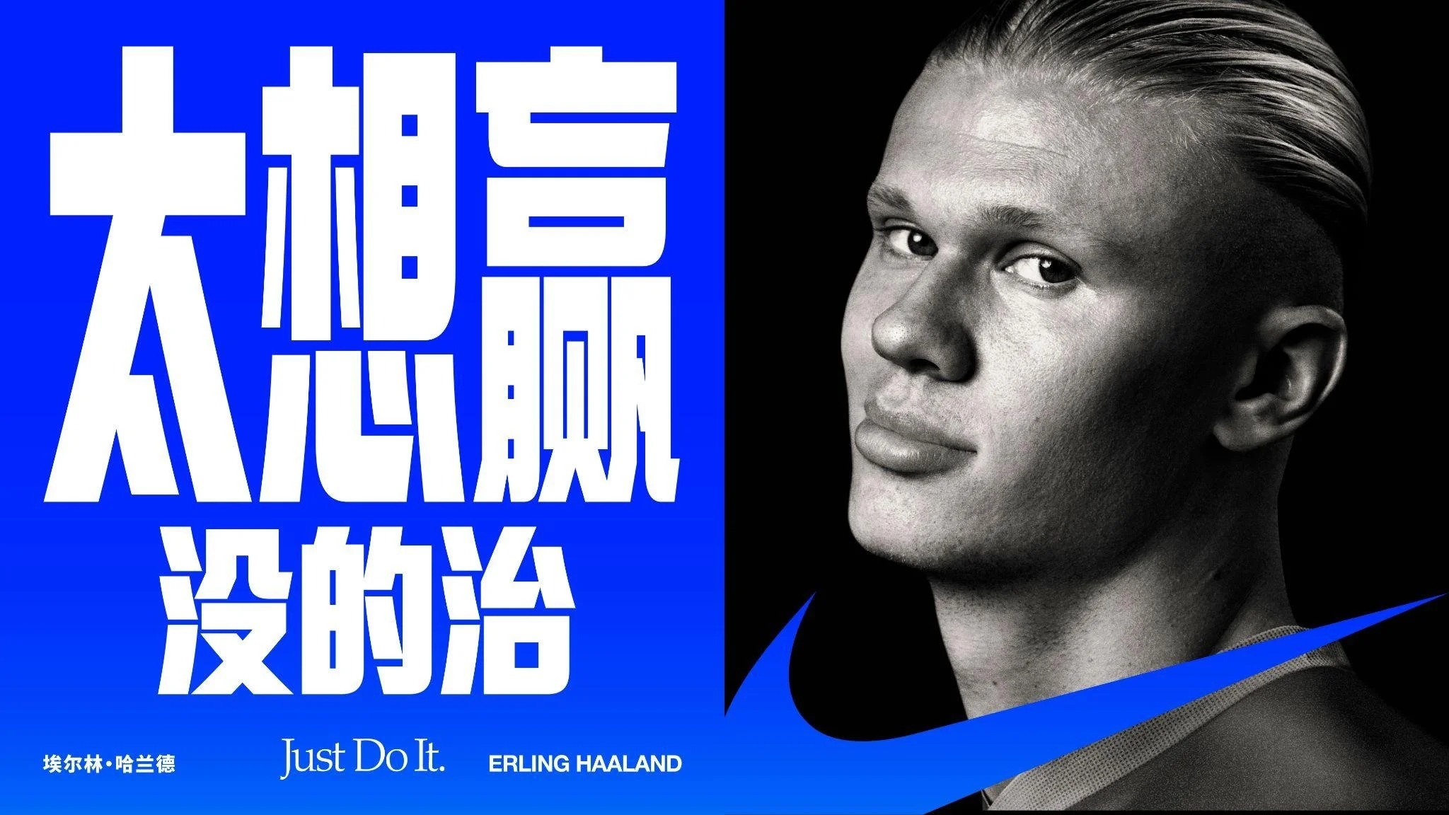
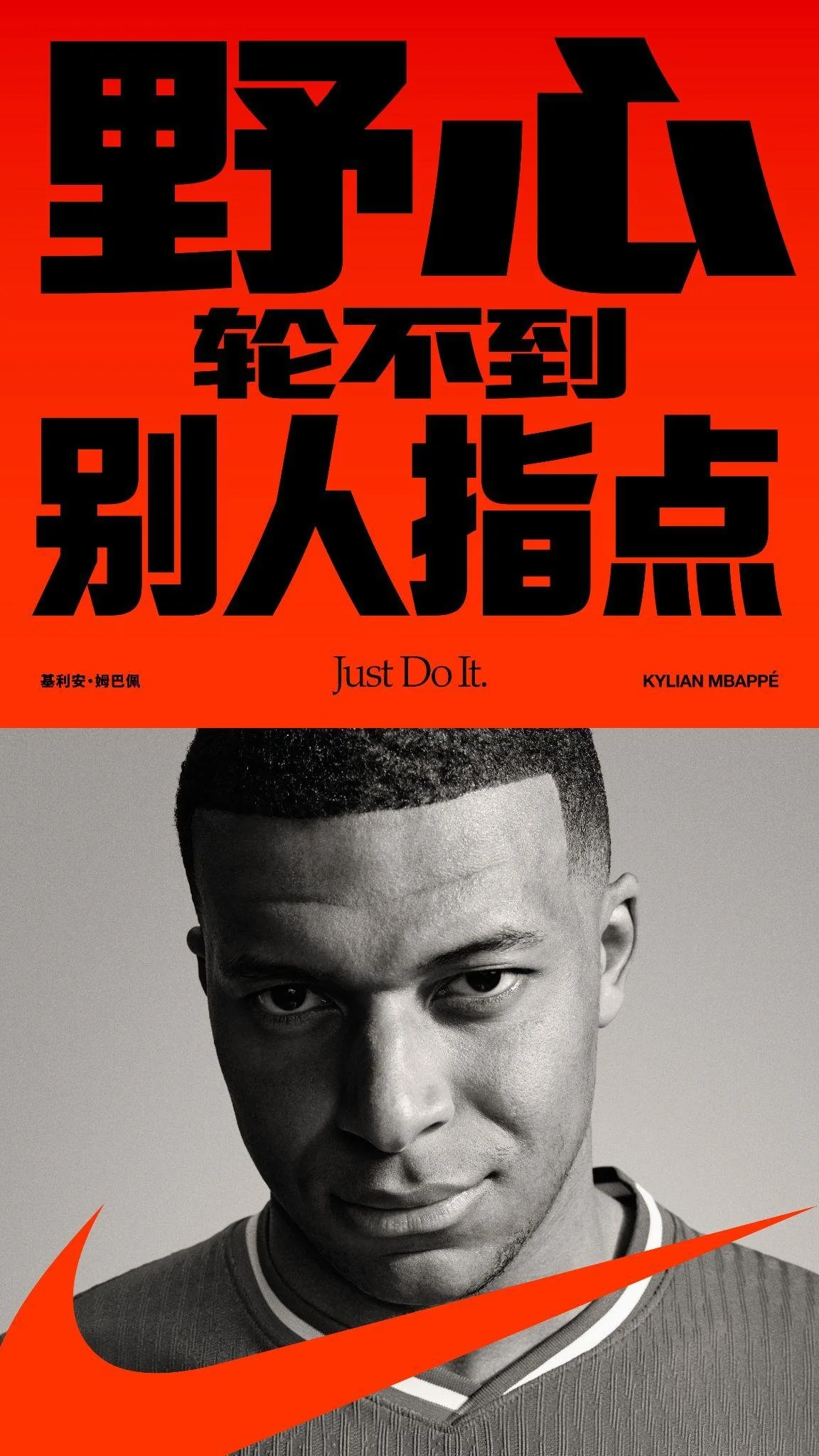
An 8503 Character Chinese expression of the brand designed to standout through both a ultra heavy weight and condensed typeset - 2 uncommon and difficult to implement features for the structurally complex Chinese language. These features are inspired by our English brand typeface, Futura Condensed ExtraBold, and now designed to pair together gracefully at scale, forever.
Since the 1980's this Futura weight has been an iconic pillar of the brand. In 2022 we aim to start that journey again for 1.5 Billion Chinese reading Athletes*
Roles: Idea, Pitch, Strategic Leadership, Creative Direction
Production: Nike Digital Design Greater China & Monotype
D&AD Award Winner
https://www.dandad.org/awards/professional/2022/235421/monotype-nike-china/
Film Password: cutfourth

Problem
Since it’s China debut in 1981, Nike has had no unified Chinese brand typeface, making it unable to communicate the brand in China consistently through typography (like many brands in China).
Why? A singular stock Chinese font has never proved right for Nike, while creating a new Chinese font is a formidable multi-year challenge.
Without a unified headline font, Nike misses half of what makes its words iconic, their shape. Every campaign, every billboard, every digital product becomes another missed opportunity to build brand equity through one Nike Chinese typographic identify.
Solution
In 1988 Nike introduced it’s English brand typeface, an off-the-shelf Futura ExtraBold Condensed. It is now an iconic pillar of the brand, instantly recognisable as Nike somewhere deep in your brain.
The Chinese language consists of 1000s of characters to the English 26. There is no off-the-shelf solution.
Let’s create the world’s first truly* branded original Chinese typeface, that can be used across all channels consistently, until it becomes instantly recognisable as Nike somewhere deep in your brain.
*Tencent and Alibaba have created typefaces, but these are system fonts first, brand fonts second.

Results
At Launch
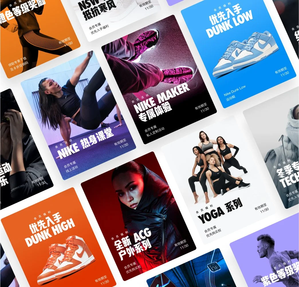
The world’s first truly branded Chinese typographic identity used at scale. It is now a standard used across all channels (see more below), and a key pillar in its overall strategic objective of making Nike feel even more of a brand for China by China.
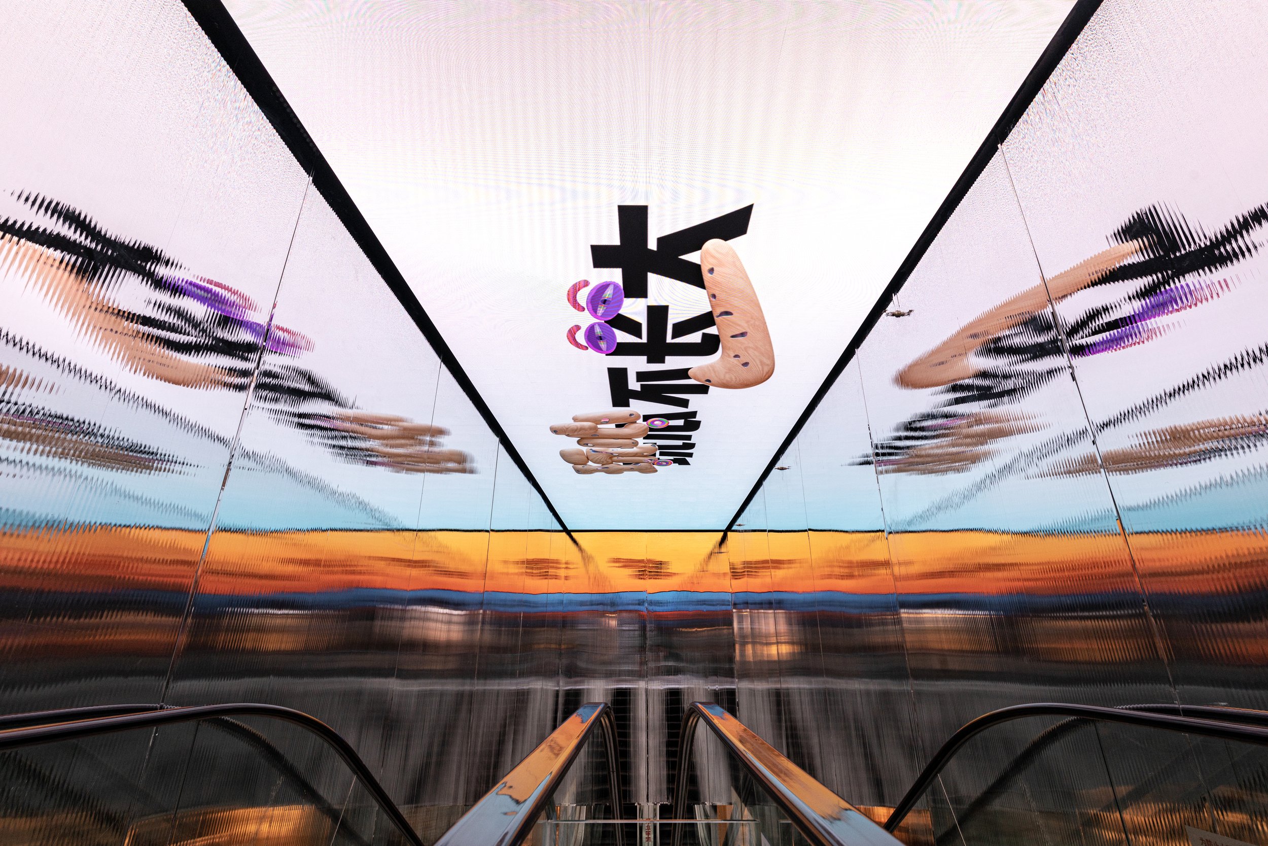
Nike’s first original brand level and non-latin typeface.
3 Years Later
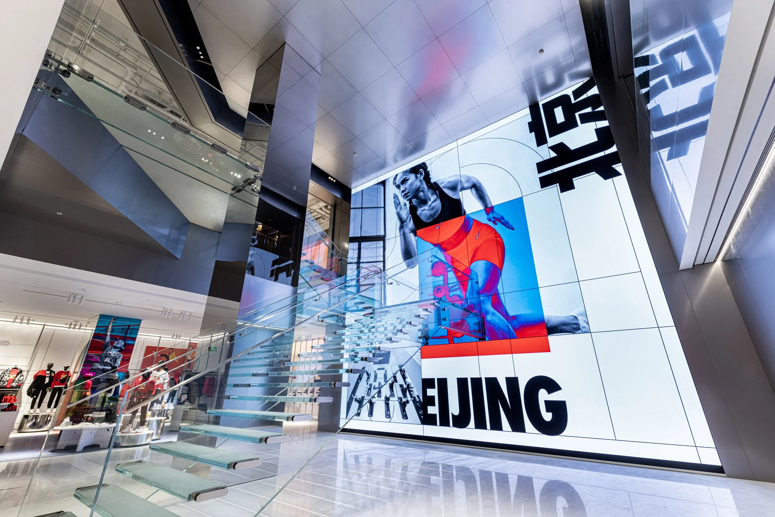
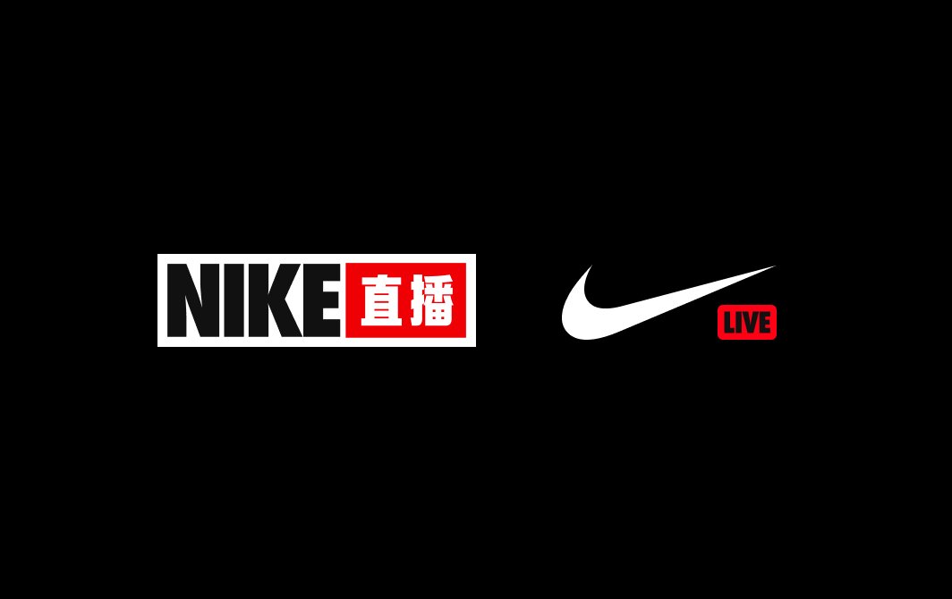
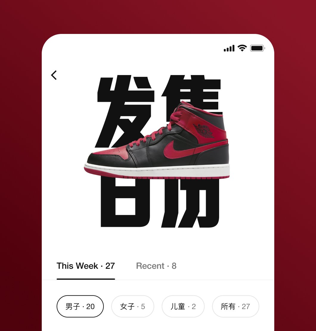
The font now lives across more Products, Advertising, Apparel, PR Releases, Stores, Events, Apps, Social, Billboards and Celebrity Collabs than can be tracked. Well on it’s way to becoming an iconic piece of Nike’s identity in Greater China.
Key Benefits
🇨🇳 An original Chinese brand typeface to stand alongside Futura.
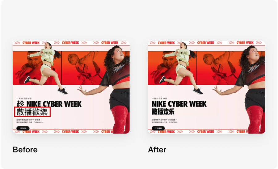
📱Chinese now fully “digital ready” unlocking brand headline
font scaling across all devices, media, stores and more.🙌 Chinese and English headlines now designed to pair
together gracefully. At scale. Forever.💰 Unlimited Designer hours saved baking headline copy into images.
🌏 World’s first truly* bespoke Chinese brand headline typeface to be used at scale, furthering Nike’s leadership position while celebrating Chinese design.
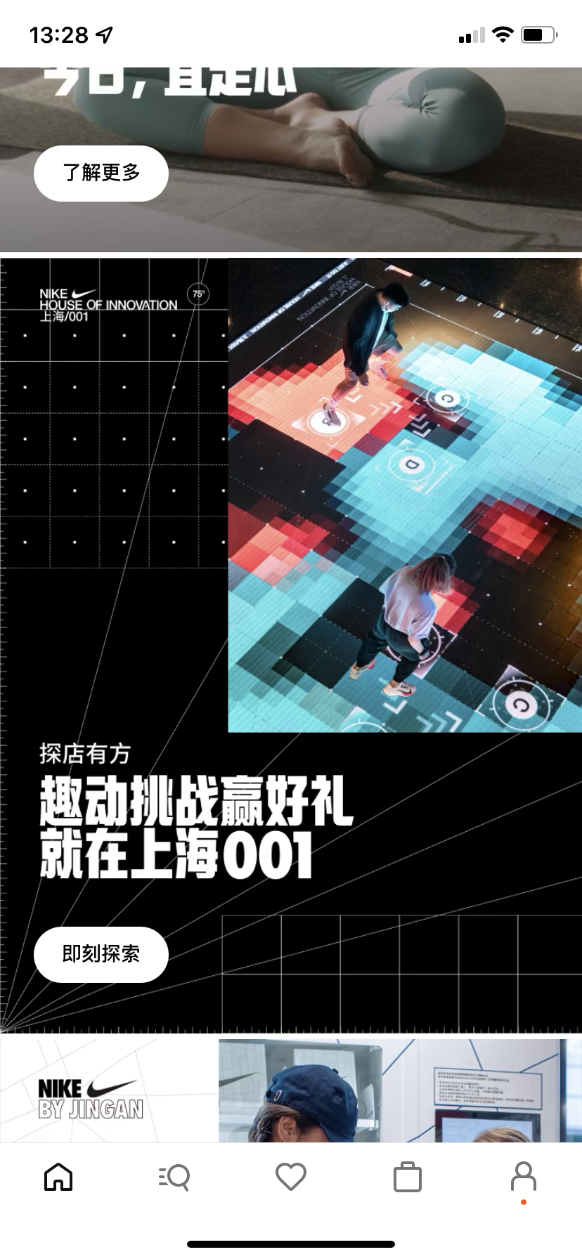
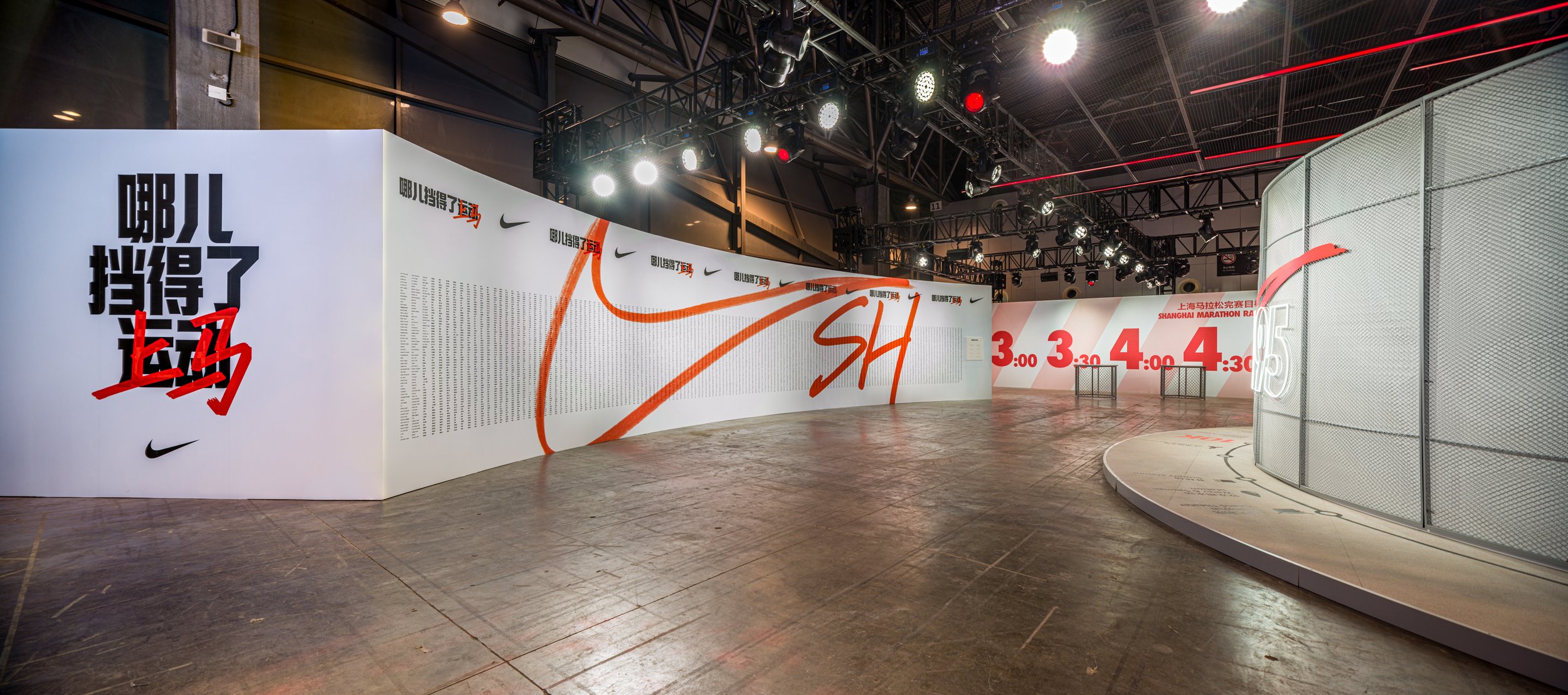
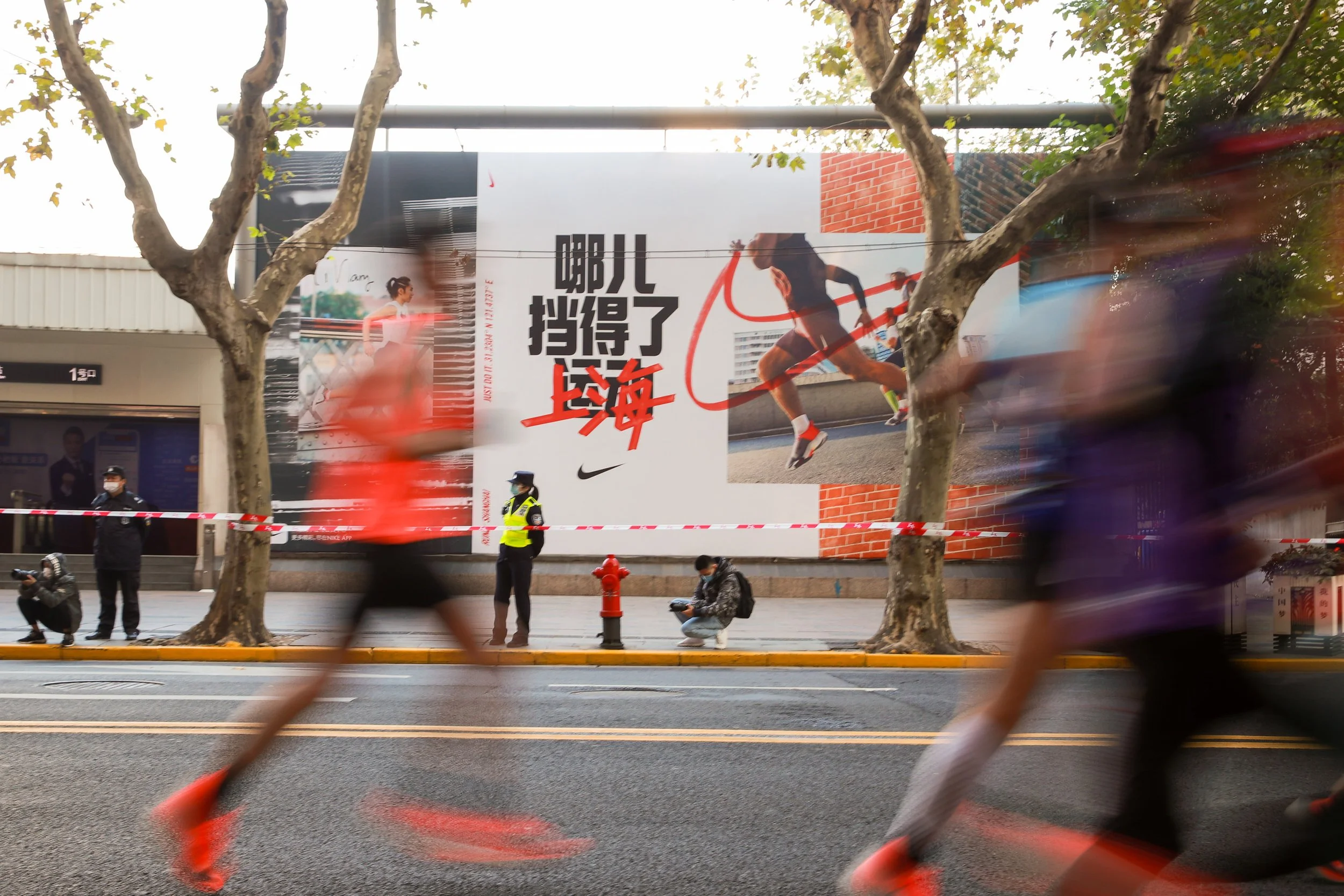
Retail
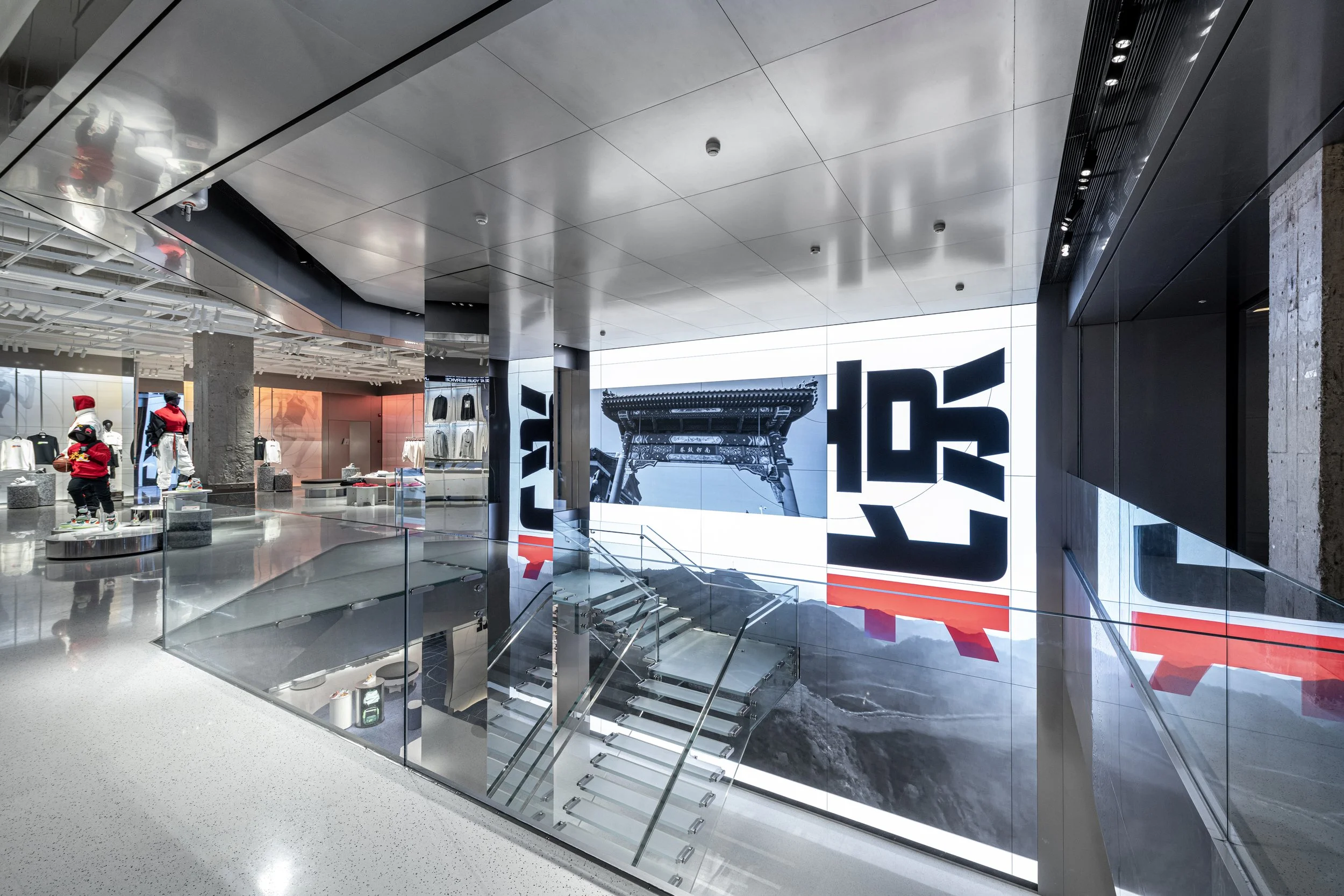
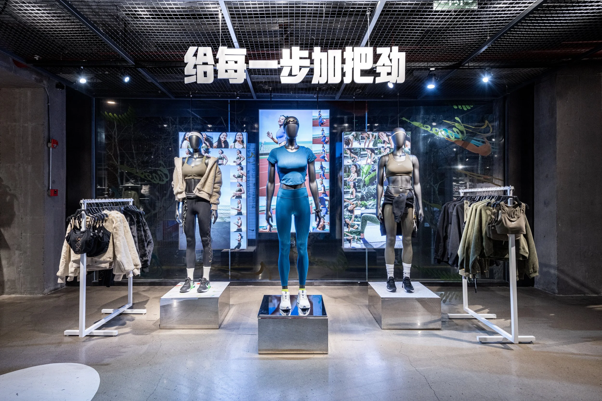
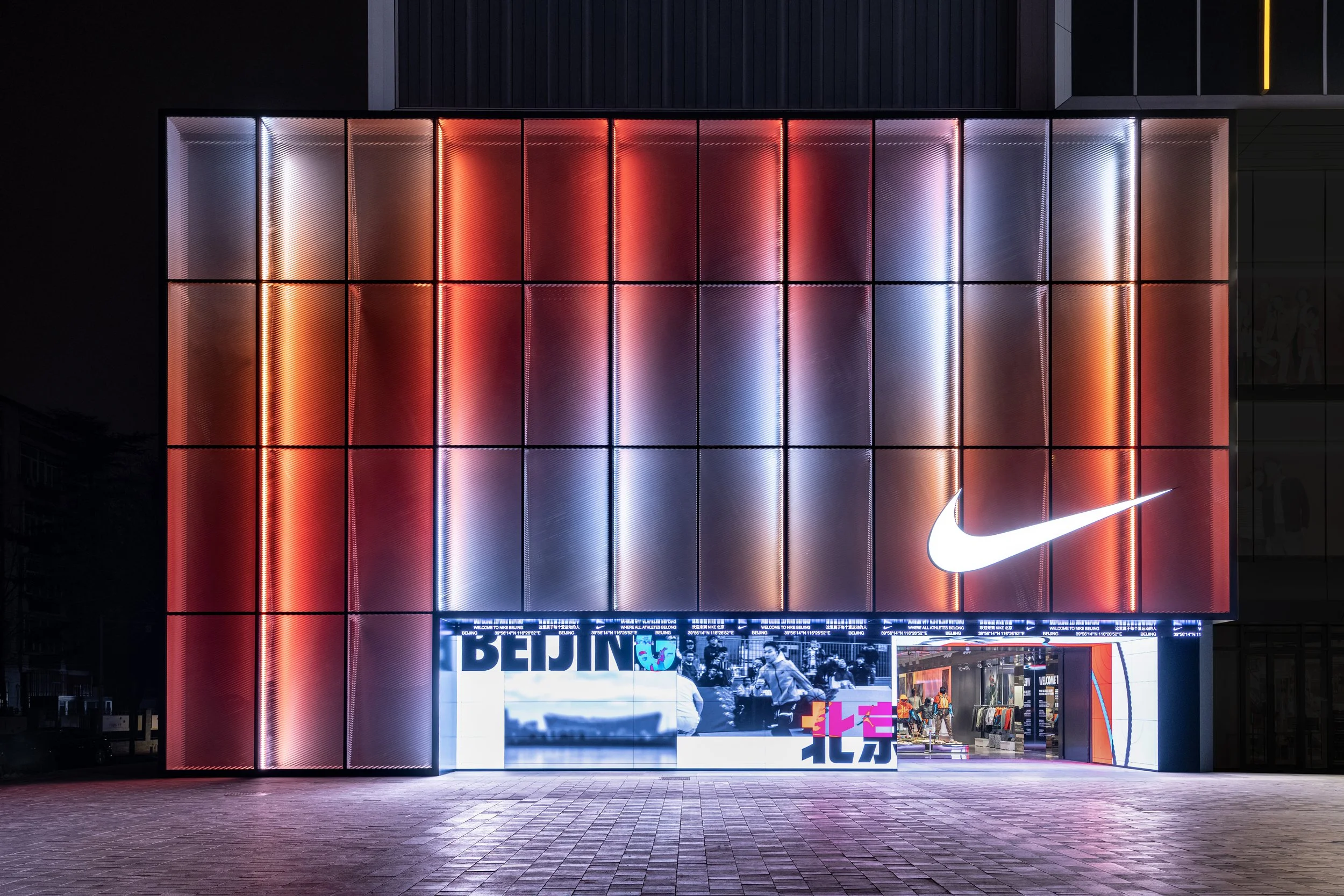
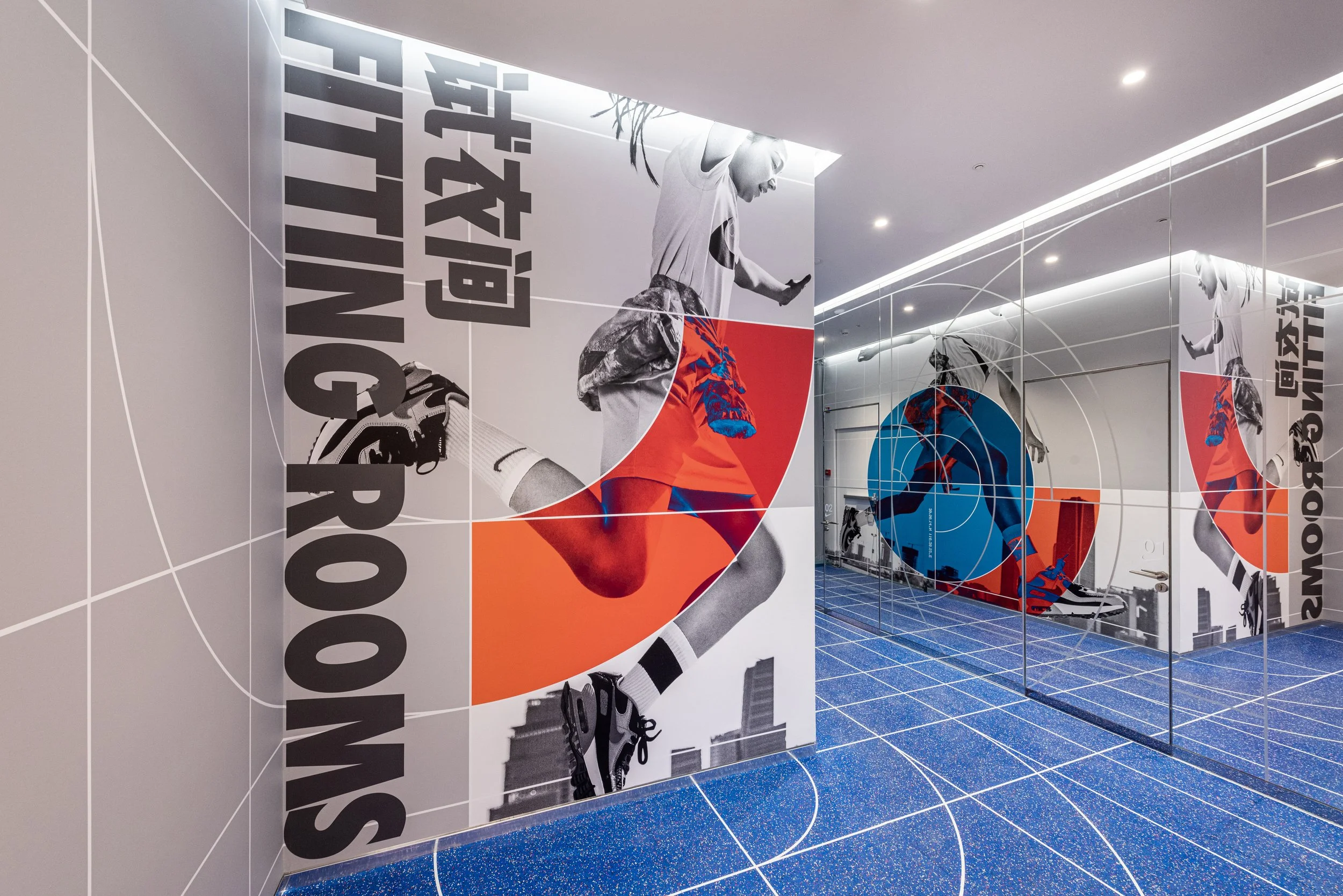
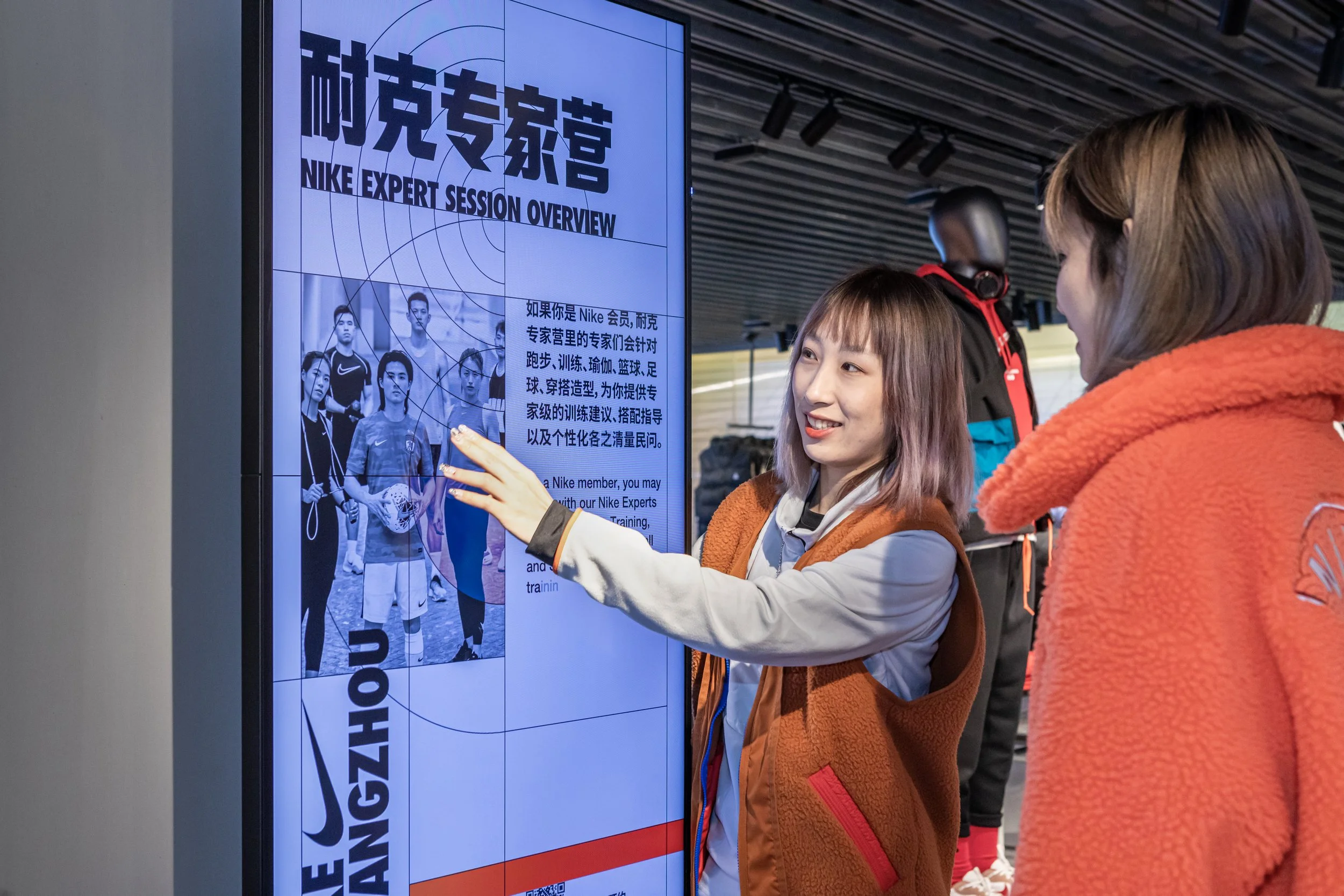
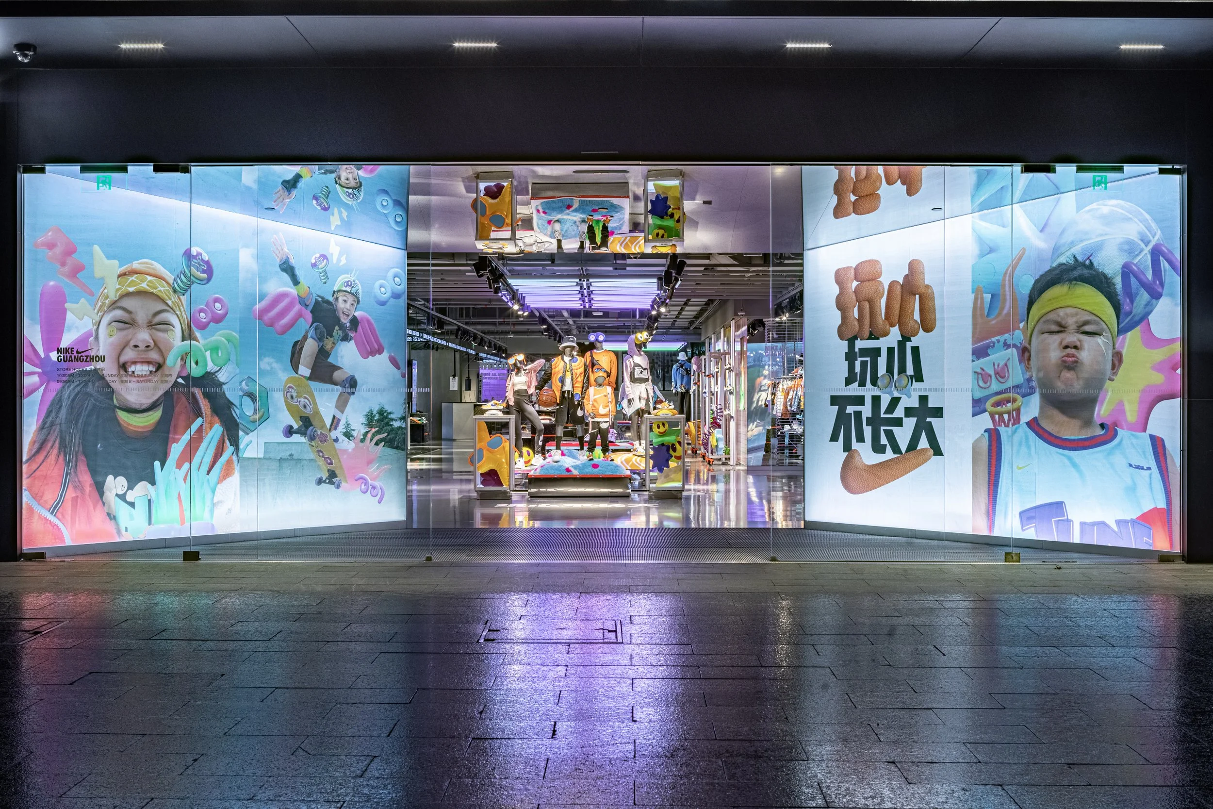
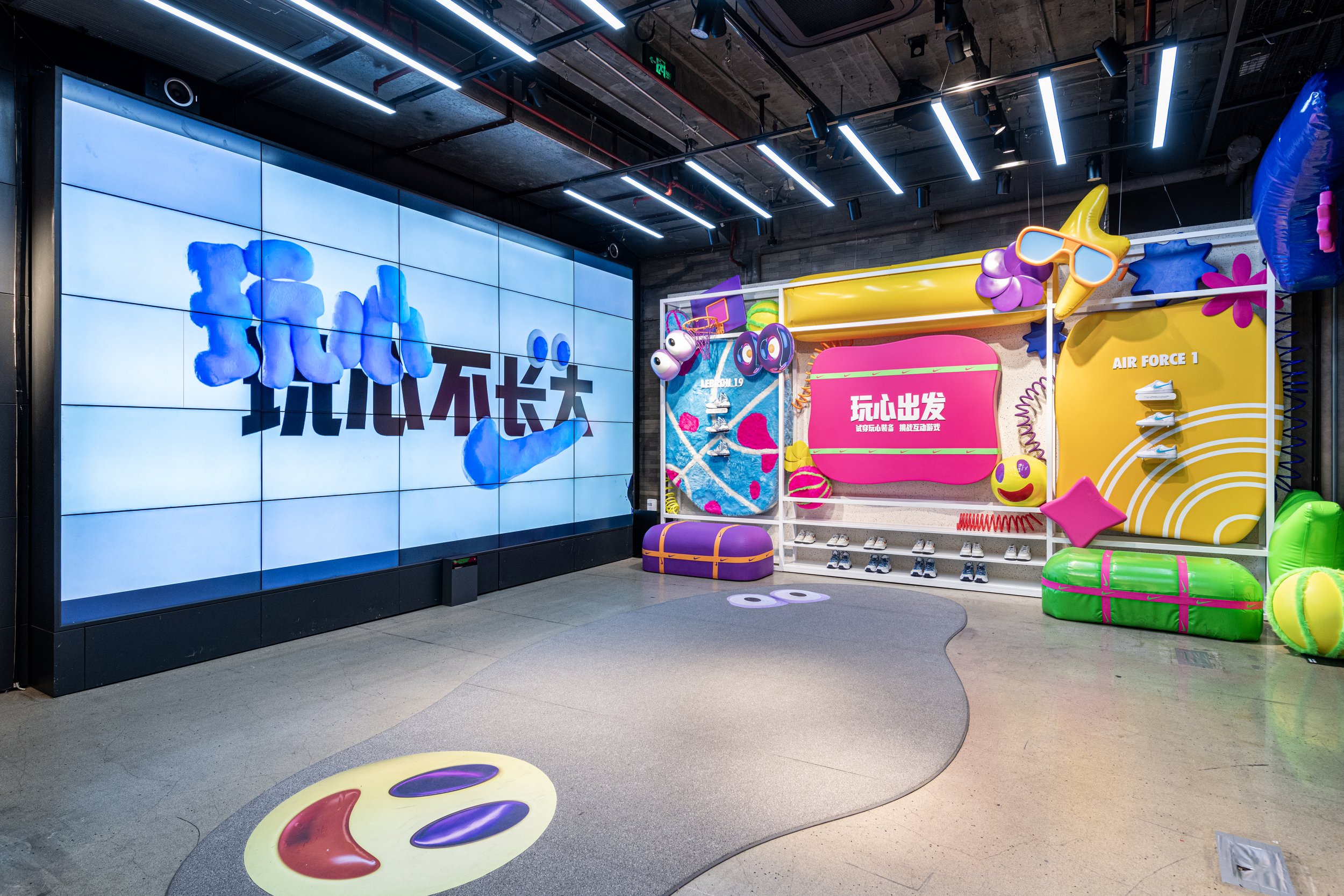
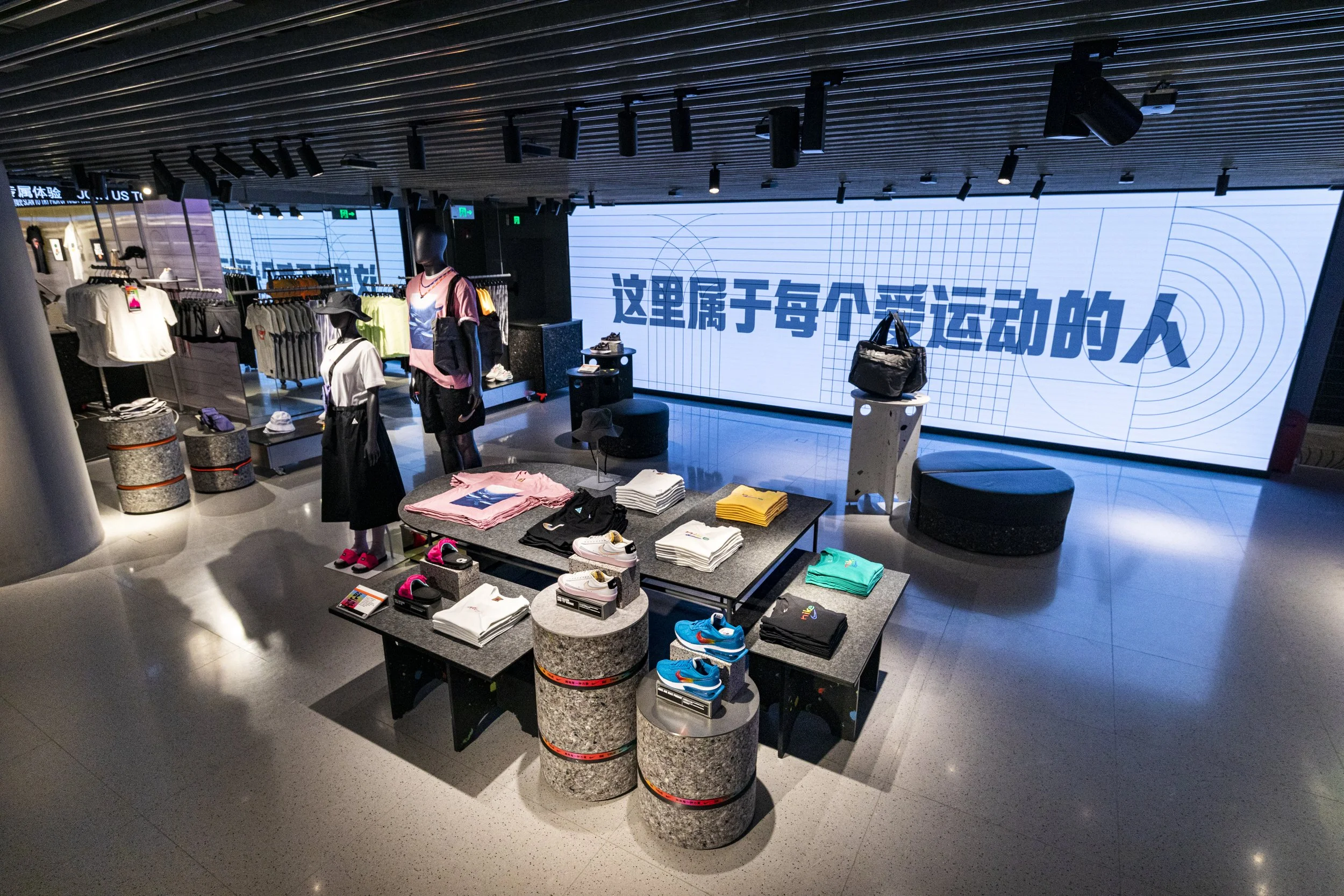
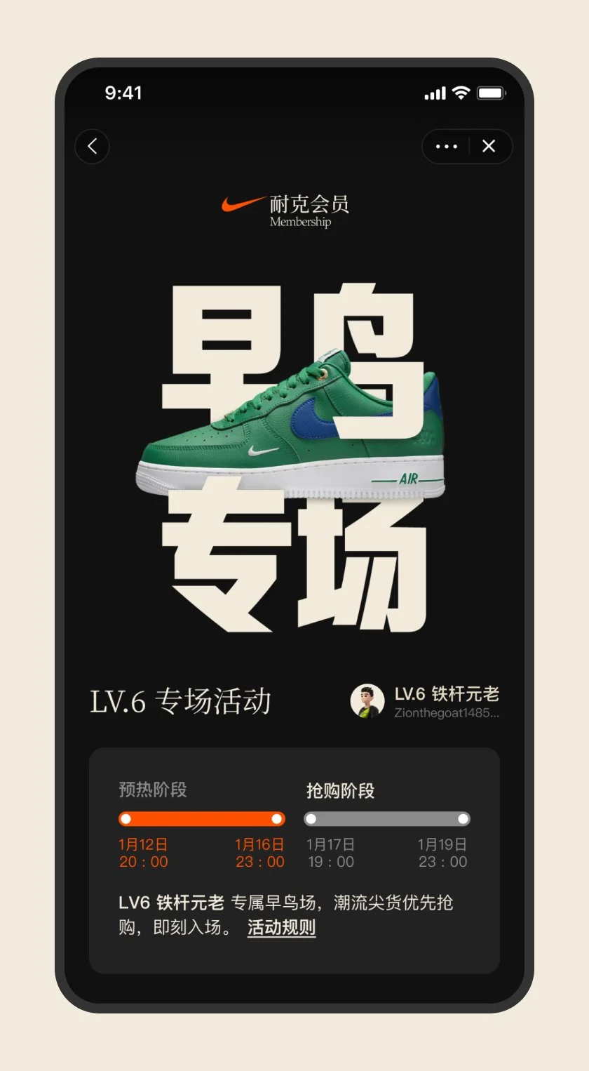
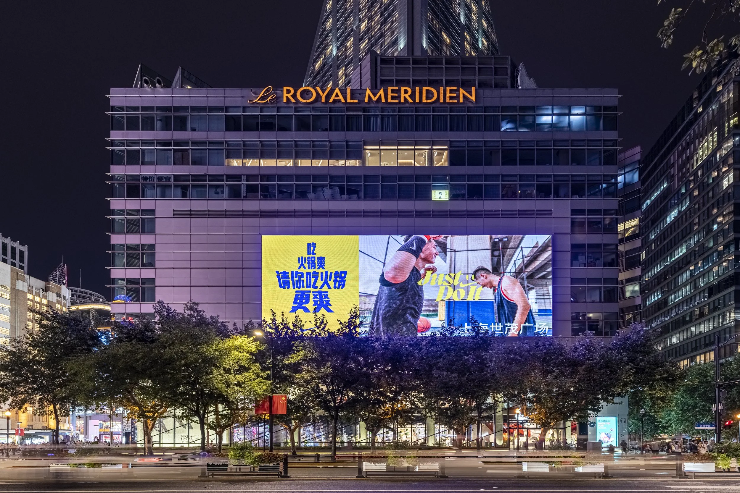
Digital

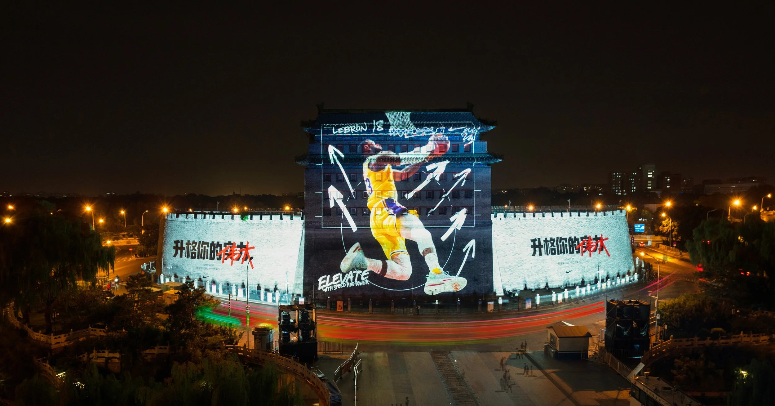
Outdoor

Now we can,
Just Type It.
Previously Nike couldn’t just type up a Chinese brand headline, there was no scaleable Chinese equivalent to Futura, which presented huge challenges in communicating our brand consistently through typography at scale, physically and digitally, year after year, decade after decade.
Without a unified brand font, we miss half of what makes our words iconic - their shape. Every campaign, every billboard, every digital product becomes another missed opportunity to build brand equity through One Nike Chinese typographic identify.